Tag Archives: harappa - Page 7

Ref1 South Asian + Harappa MDS MClust

Now I am going nuts on this dataset consisting of South Asians (minus Kalash and Hazara) from Reference I and some Harappa participants, but I promise this is the last item on this specific data. I will however do similar analyses some time after integrating all the new South Asian samples I have gotten (via project participation as well as from research data).

I ran MDS on the data in Plink and then retaining various number of MDS dimensions, ran MClust on it. This is what Dienekes calls Clusters Galore.

Here are the plots of the MDS, two dimensions at a time.

The graph of number of MDS dimensions retained versus optimum number of clusters computed by Mclust is as follows:

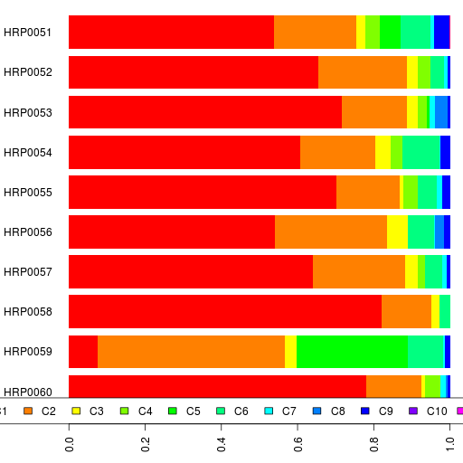
The maximum number of clusters (28) are inferred with 8 MDS dimensions. So I posted the clustering results for 8 MDS dimensions + 28 clusters.

Some observations on the clusters:

  1. 56 of the 62 Gujaratis are in cluster CL1 and the remaining 6 are in CL5. Both are Gujarati-only clusters. Let's see where the Harappa Gujaratis fall next time I do this analysis,
  2. CL2 has an Andhra Reddy, Caribbean Indians, a Keralan, a few Gujaratis-B, and a third of the Singapore Indians.
  3. Gujaratis-B are a varied lot spread out into CL3, CL7, CL2, CL8, CL4, CL6, and CL15, but half are in CL3.
  4. CL6 has a lot of the South Indian Brahmins
  5. Burusho are isolated
  6. Punjabis from the project seem to be divided among CL7, CL8 and CL15.

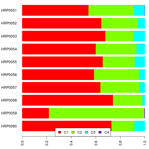
I also posted the results for 20 MDS dimensions resulting in 21 clusters.

Ref1 South Asians + Harappa PCA Clusters II

Using the PCA data for Reference I South Asians plus project participants, Sriram computed a tree-based clustering called clique optimization. The result for that is a pdf file. Take a look!

Thanks, Sriram!Балки

Ref1 South Asian + Harappa Admixture

Since I was working on this dataset consisting of South Asians (minus Kalash and Hazara) from Reference I and some Harappa participants, I thought I would run Admixture on it.

The optimum value for the number of ancestral populations K is 3 in this case. Roughly the three ancestral components correspond to South India, Balochistan and Gujarat.

The spreadsheet showing the admixture results is here. The first sheet shows the individual results for reference samples as well as project participants.

The 2nd sheet shows the average (and standard deviation) for the reference populations.

The 3rd sheet shows the average and standard deviation for each cluster computed by MClust. I included only the samples which had at least 90% probability of belonging to a cluster.

Note how clusters CL8, CL9 and CL13 have a lot more variation than the others. Of course, I am in CL9 along with some fairly eclectic samples.

Admixture K=12, HRP0051-HRP0060

Here are their ethnic backgrounds and the results spreadsheet. Also relevant are the reference I admixture results.

If you can't see the interactive bar chart above, here's a static image.

Look at how different the two Gujaratis are. Also, the Iraqi Kurd is more like our Iranian participants than the two Iraqi Arab participants.

PS. This was run using Admixture version 1.04.

Admixture K=4, HRP0051-HRP0060

Here are their ethnic backgrounds and the results spreadsheet. Also relevant are the reference I admixture results.

The interesting samples here are the Gujaratis and the Kurd.

If you can't see the interactive bar chart above, here's a static image.

PS. This was run using Admixture version 1.04.

Ref1 South Asians + Harappa PCA Clusters

Using the PCA results of the South Asians in Reference I as well as Harappa participants, I ran a couple of clustering algorithms.

First, I scaled the principal components by the respective eigenvalues.

Using Euclidean distance for hierarchical clustering with complete linkage, here's the dendrogram for the Harappa Project participants.

You can compare this to the Admixture-based dendrogram:

The most obvious thing is that I (HRP0001) am an outlier by far.

We inferred three major clusters with the admixture results. Those are intact, though changed a little.

I also ran MClust on the PCA data. The optimum number of clusters was 14. The resulting cluster assignments can be seen in a spreadsheet.

For the Harappa Project participants, the numbers give the probability of assignment to a cluster. For example, for HRP0009 there is a 72% of belonging to cluster 4. For the reference populations, the numbers give the expected number of samples assigned to a cluster.

Harappa Participant Admixture Maps

Following maps of the reference populations, Simranjit has gone ahead and included the Harappa Project participants in these maps as well.

Here's what he said:

I'm now incorporating project participants into the maps. I had to drop admixed individuals, however, and I made some choices, dropped the Bihari Kayastha and the Tamil Nadu non-Brahmin for now, as they differ a fair bit. Take note that as we don't have reference sample for some countries so this sometimes can cause the interpolation to be off (e.g. lack of Central Asian republics other than Uzbekistan is skewing Central Asia to be more South Asian than it really is).

These maps are based on K=12 admixture run.

The gradation is from Dark green (low) to Dark red (high) for most of them.

Basically the percentages for each Component are divided into 32 equal intervals, to create the contour effect. Take note that it represents relative values not absolute.

C1 South Asian component:

C2 Balochistan/Caucasus component:

C6 European component:

Distance Measures

Referring to the dendrogram computed from the admixture results of Harappa Project participants, Thorfinn asked a long time ago:

Interesting that South Indian/Cow Belt Brahmins cluster together; while Punjabi Brahmins are closer to Punjabis.

I can understand the first clustering, assuming that Southern Brahmin communities are a spinoff of northern communities and have maintained relative genetic isolation; and the source Northern Brahmin population differed in original origin from other Cow Belt populations.

But how do both Brahmin communities differ equally from Punjabi/Rajasthani Brahmins; and why is that community closer to other Punjabi populations?

In terms of admixture results, that is correct in the case of the project participants. Why this is the case, I have no idea.

However, there is an issue here that we have to consider and nsriram commented about it:

The euclidean distance doesn’t seem to be the appropriate metric to capture the pairwise similarities. Once you make a commitment to the distance measure then the side effects carry-over into the tree construction.

What is a good distance measure to compute the similarity or dissimilarity of the admixture results of two people? Is the Euclidean distance a good one in this case? It certainly is the most common and the easiest to use I guess. So we usually default to it.

However, if we look at the Fst divergences of the ancestral components, we see that the different components are more or less different from each other. So a 5% difference in C1 might not be the same as a 5% difference in C10.

A solution might be to use a weighted distance, but how to weight it? The Fst numbers give pairwise distances for the different ancestral populations. If you are focused on a specific population (e.g., South Asians), we could try weighting by the Fst values between that component and the others. But I am not sure if that's a good solution either.

In the end, a Euclidean distance measure gives us a rough idea of the differences between admixture results, but it should not be used to explain minor differences or to consider phylogenies.

Harappa Participants on 3-D PCA

sv wanted to see where he was on the South Asian 3-D PCA plot, so I obliged.

It's a quick and dirty method, but you should see a dropdown select box under the 3-D plot. Just select one of the participant IDs from there and that person's dot on the 3-D plot should increase in size so that it's easier to spot.

Admixture K=12, HRP0041-HRP0050

Here are their ethnic backgrounds and the results spreadsheet. Also relevant are the reference I admixture results.

If you can't see the interactive bar chart above, here's a static image.

PS. This was run using Admixture version 1.04.